Overview

Dental Istria Group is a leader in Croatian dental care, providing cutting-edge treatments and exceptional service across two flagship clinics. Tasked with revamping their outdated website, I tackled inconsistent design and clunky navigation, transforming the digital experience into a seamless, user-focused journey. The result: a modern platform that streamlines appointments, boosts accessibility, and reflects the group’s commitment to professionalism and patient care for a diverse clientele.
My role
UX/UI Product Designer
Live project
www.dental-istria.com

Results at a glance

Achievements in the first few months after launching the new website.

+3%

+3% increase in conversions within three months of launching. With continual improvements over a three year period.

+600%

Average time on website went up from ~30 seconds to just under ~4 minutes, showing that clients are finding the content useful.

+5h

+5 hours a week saved on appointment management, allowing the team to focus on client satisfaction.

+30-53%

+53% more returning clients and +30% less no shows thanks to automatic email/SMS reminders.

Creating research goals

Major pain points of the current Dental Istria's experience were:
  • Information about services is not laid out properly.
  • Difficult finding contact information.
  • Difficult to make a booking and keep track of an appointment.
  • Poor mobile experience and slow to load website.

Design process

By blending the double diamond approach with user-centred design, we fine-tune every stage of the process, ensuring the end product is perfectly crafted for our users' needs.

User journey map

Competitor analysis

The European dental market, valued at $36 billion in 2021, is projected to grow to $65 billion by 2030, driven by rising demand for cosmetic dentistry, preventive care, and dental tourism.

Key facts across the close competition:
  • Comprehensive Care: Modern clinics offer preventive, cosmetic, orthodontic, and restorative treatments like cleanings, fillings, braces, implants, and whitening.
  • Tech Advancements: Digital imaging, CAD/CAM, and laser dentistry enhance precision and comfort.
  • Rising Demand: Cosmetic and preventive care are in demand due to increased oral health awareness.
  • Dental Tourism in Croatia: Known for affordable, high-quality care, Croatia is a dental tourism hub.
  • Behavior analytics

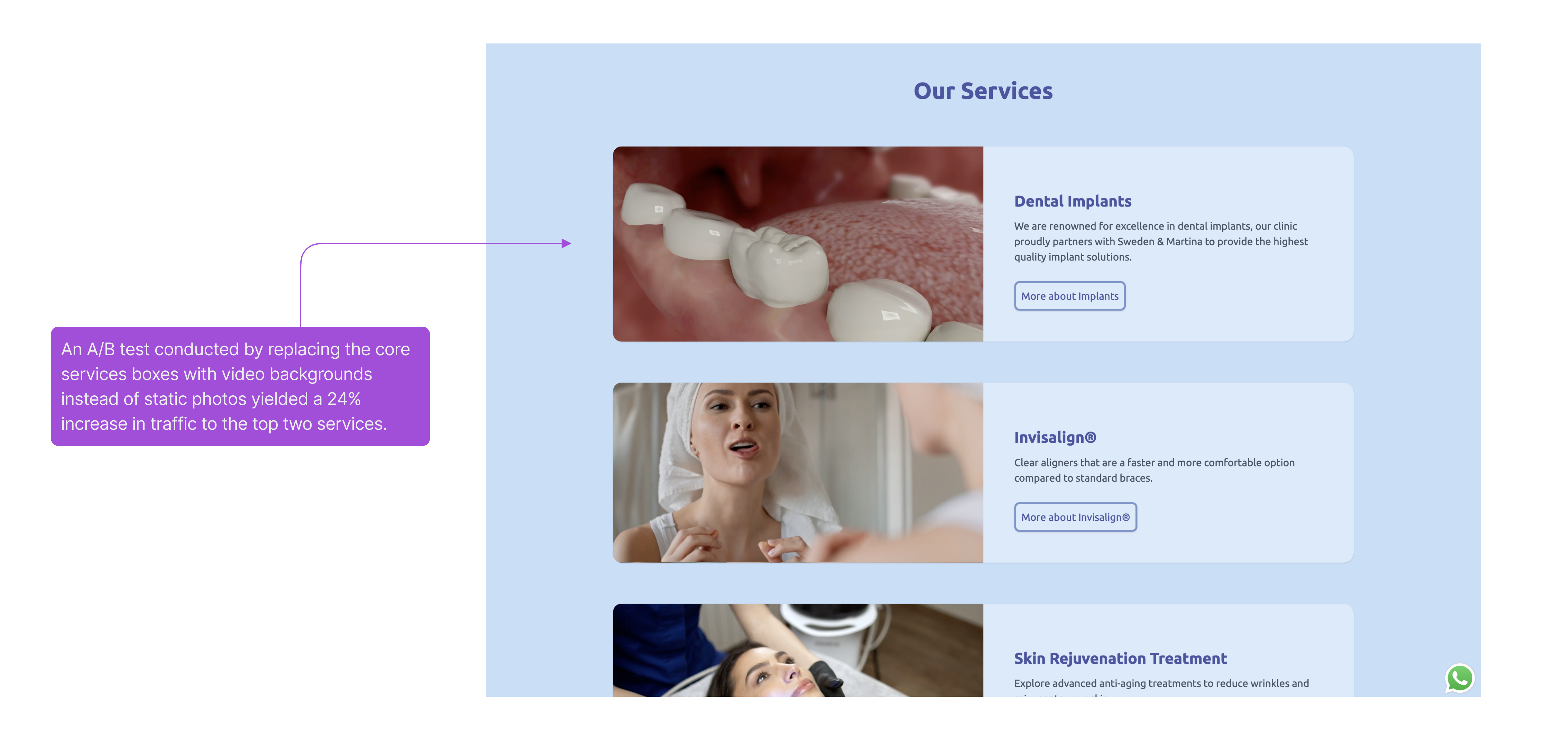
    Data based on the last 6 months of website interactions and appointment bookings.

    • Website home page: 48% of users start browsing from here. It's the most common entry point.
  • Appointment booking: 15% go straight to the booking page, with 22% completing the process (based on analytics data).
  • Specific dental services page: 20% visit service pages, with 30% exploring multiple pages before booking (most of these users starting point was Google Ads).
  • Contact page: 17% check the contact page for clinic details like phone or location.
    • WhatsApp chat button: 18% of visitors click the WhatsApp chat button, mainly asking about pricing or available dates.

    Languages spoken by users: 34% of users speak Italian, 28% speak Croatian, 15% speak English, 12% speak German, 11% speak other language.

    User flow map

    Information architecture

    Hi-Fi wireframes

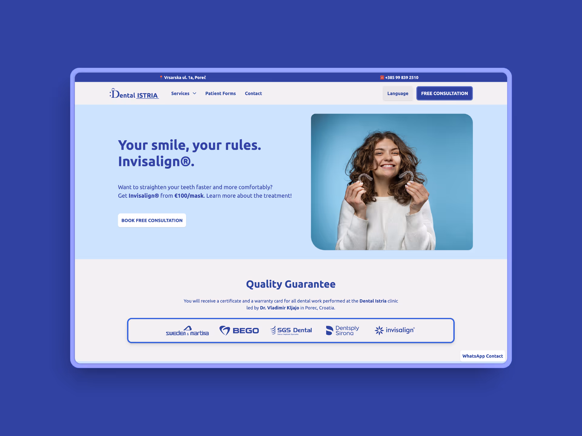
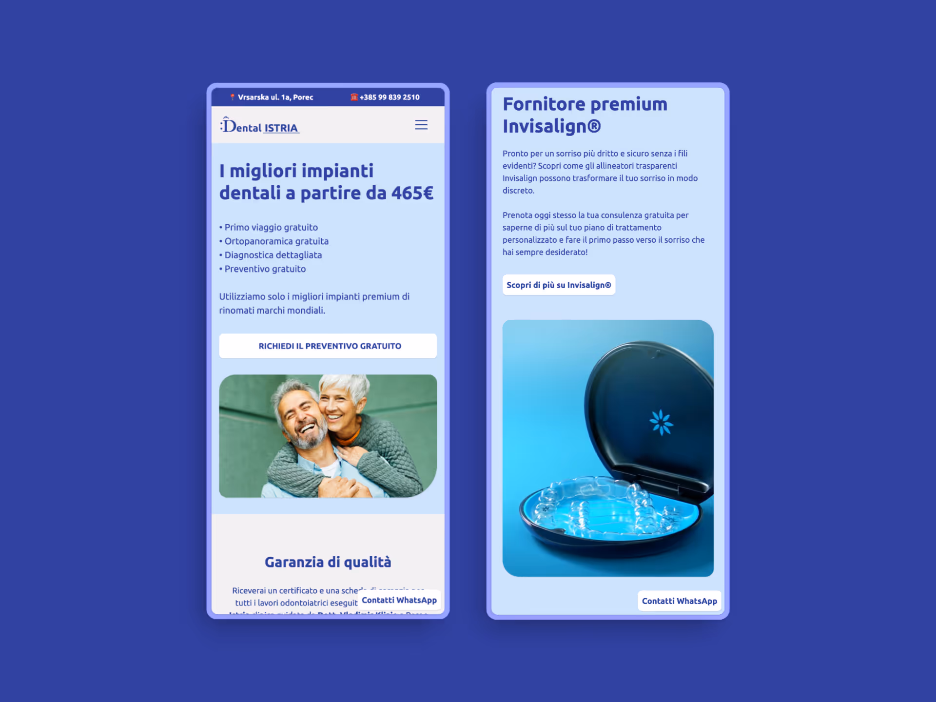
    Take a sneak peak at the first draft of the hi-fi wireframes in the figma file.

    User testing & pain points

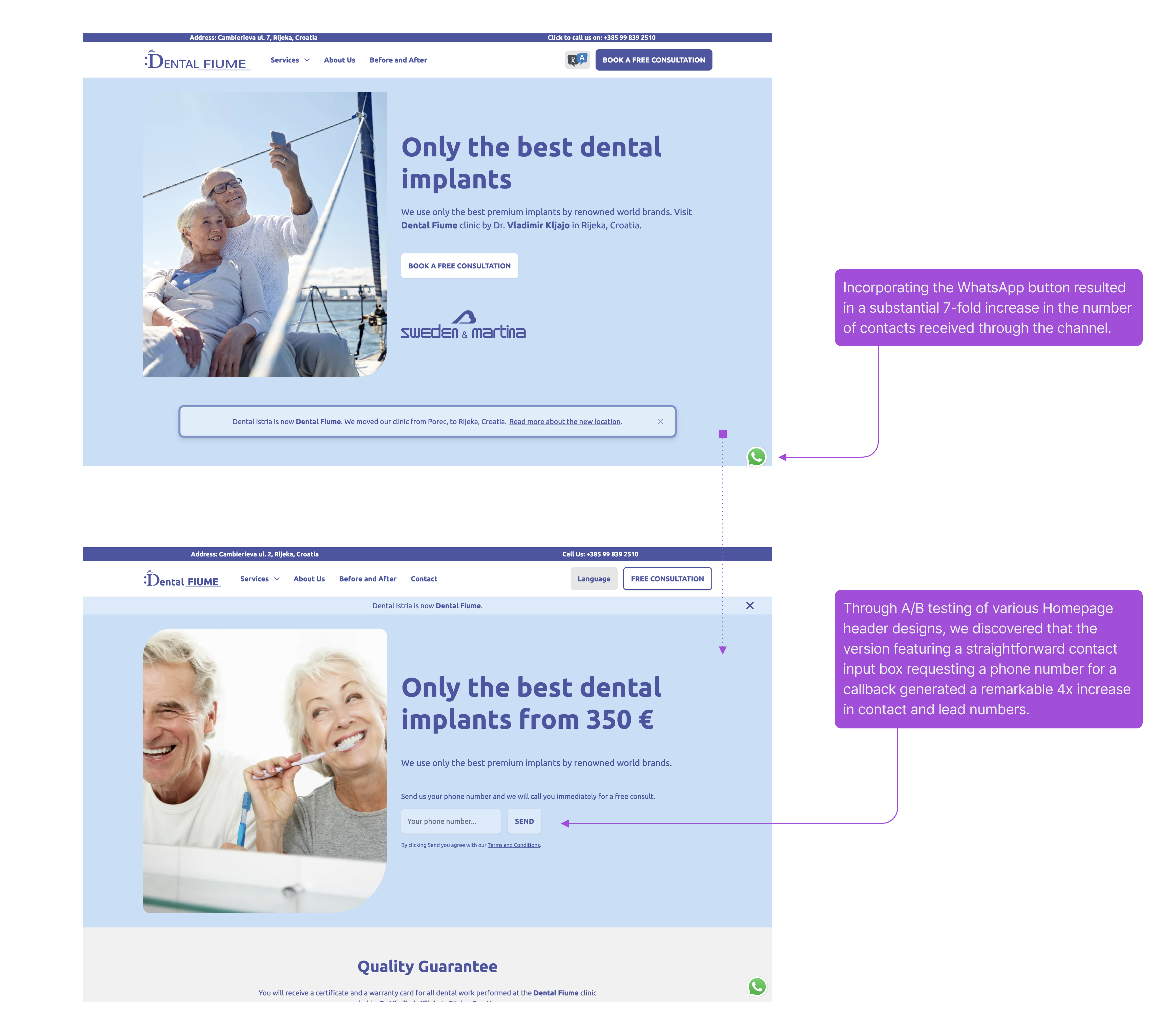
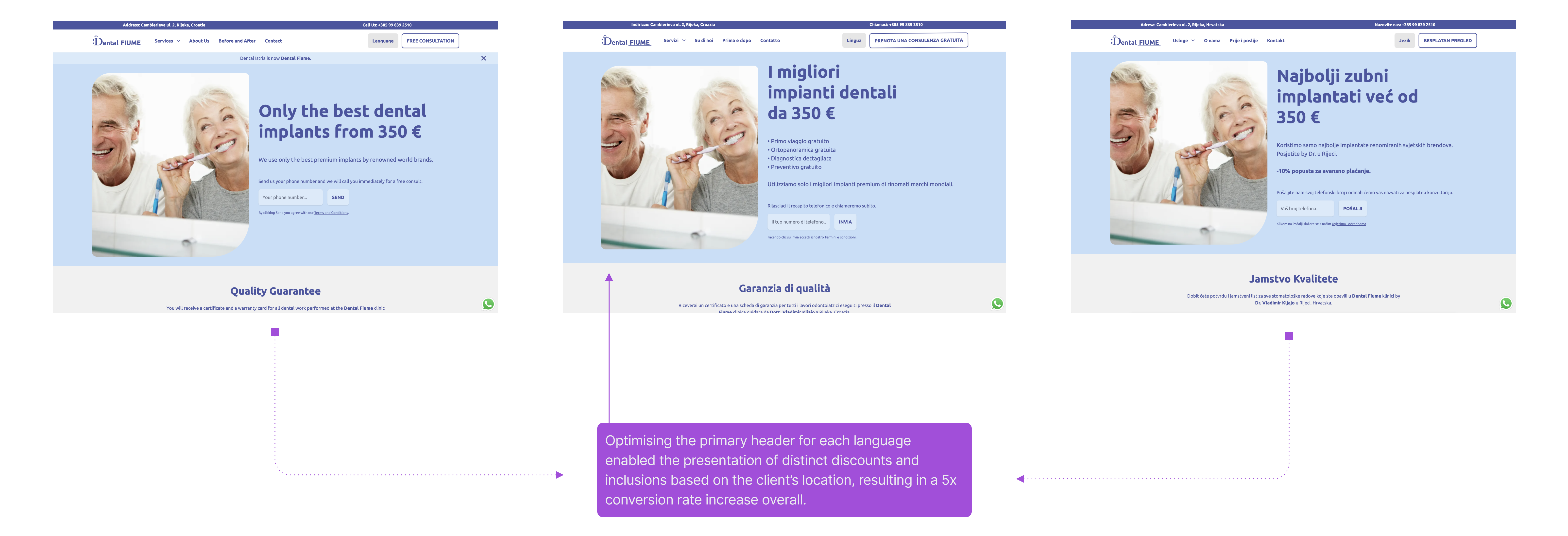
    During testing, we evaluated high-fidelity designs with a diverse group of clients and staff, avoiding live observation to prevent bias.

    Instead, participants accessed a test link connected to PostHog, enabling live session recordings and heatmaps for data-driven insights. This approach helped us assess whether we resolved key pain points, identified improvement opportunities, and enhanced the overall UX.

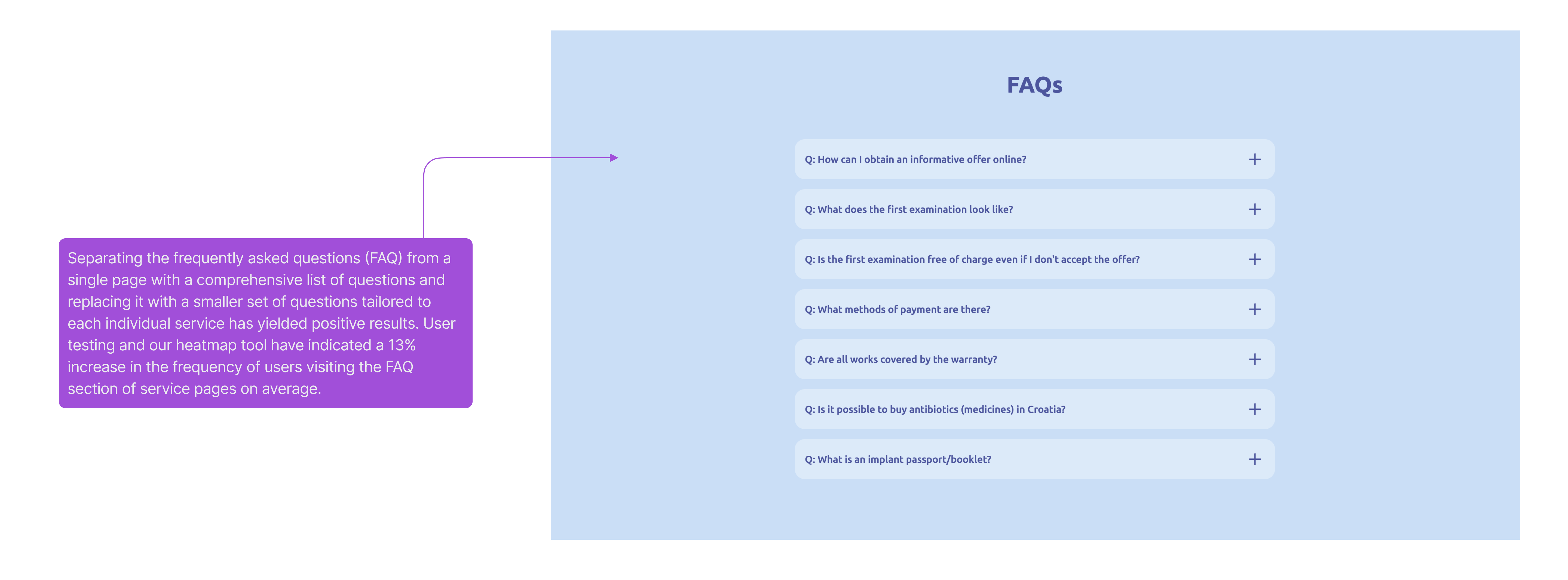
    The process uncovered various issues and potential improvements, which were addressed in the final designs. Key findings are outlined here.

    Design system

    The design system wasn’t made just for the website. It’s also for the whole online and offline design process of Dental Fiume. We want to make sure that the right colours, buttons, icons, typography, and more are all used in the right way to keep the brand looking consistent.

    Final design

    The design achieved a strong balance of user-friendliness and clear messaging, driving an increase in conversion rates.

    Ongoing efforts focus on continuous improvement to stay aligned with evolving client needs, clinic services, and market trends.