Switching gears from video production and marketing, I dove headfirst into the world of UX/UI at Roller Technic.
My mission: untangle complexity and bring clarity to a fast-paced B2B dashboard where speed and automation rule.
I partnered up, learned fast, and kept the team moving forward. Especially when it came to weaving AI into the everyday workflow.
Managed a full slate of projects at once:
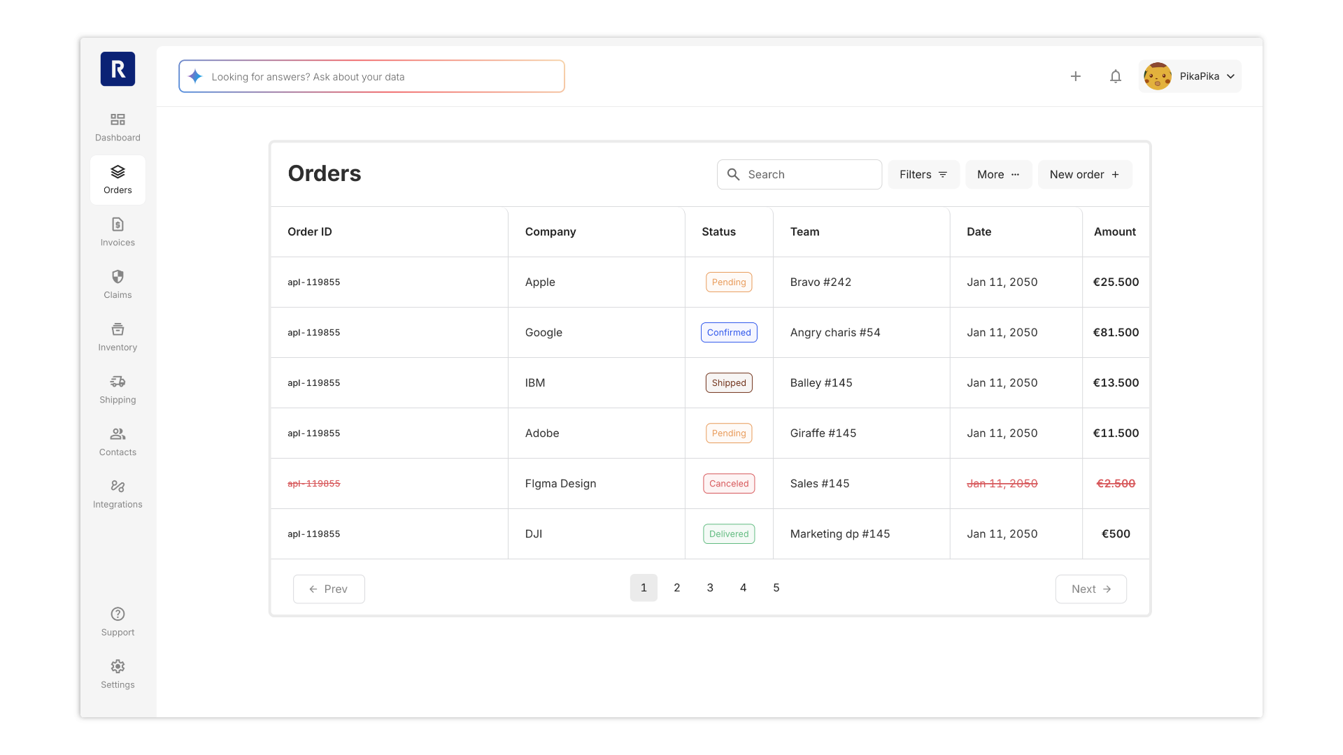
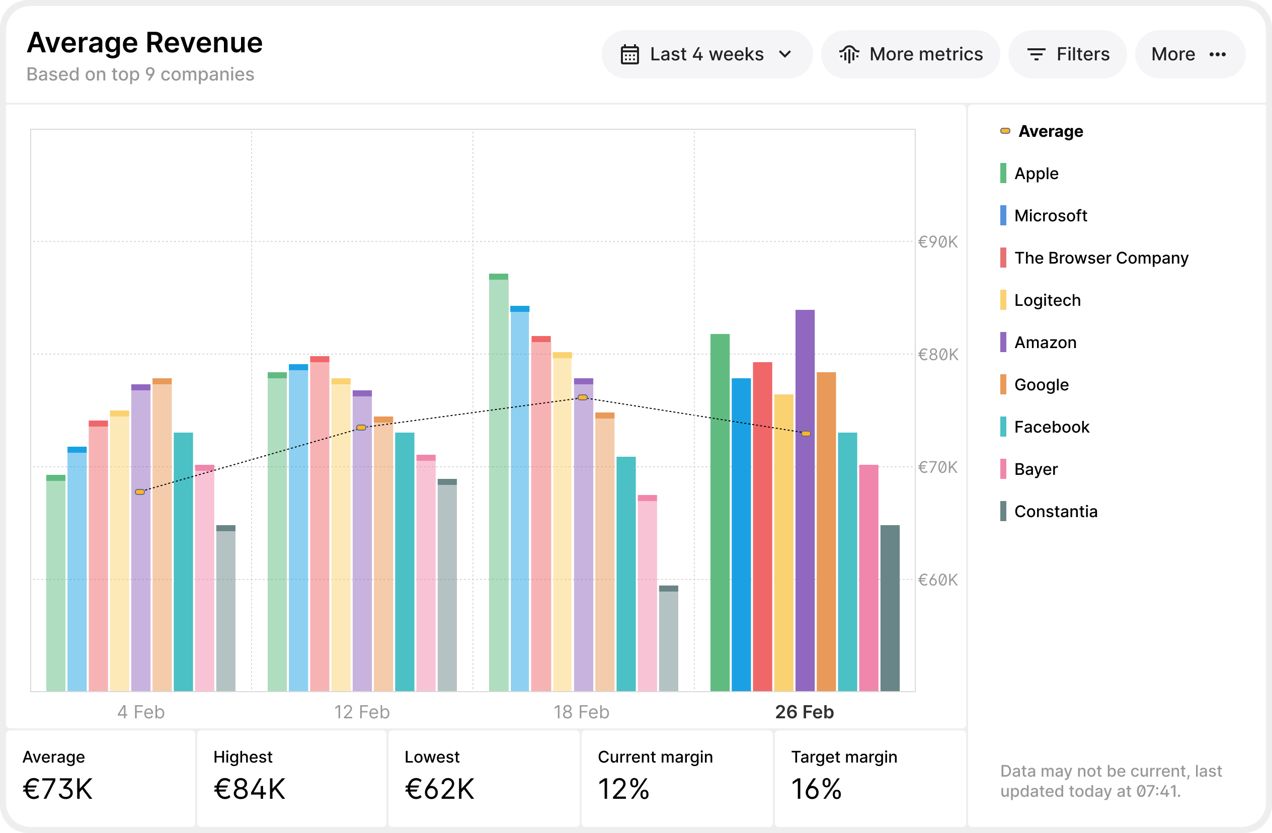
Charts and table upgrades
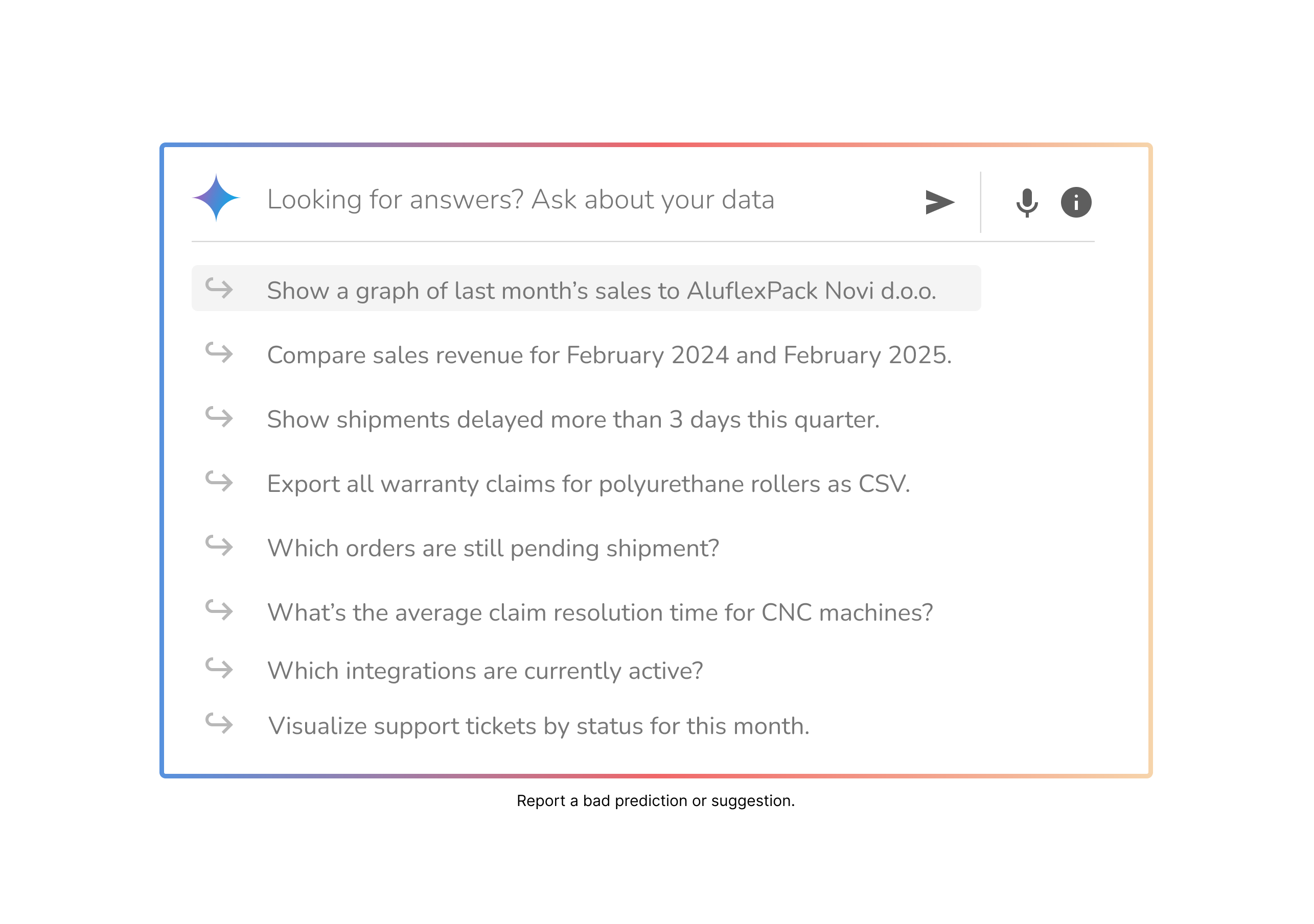
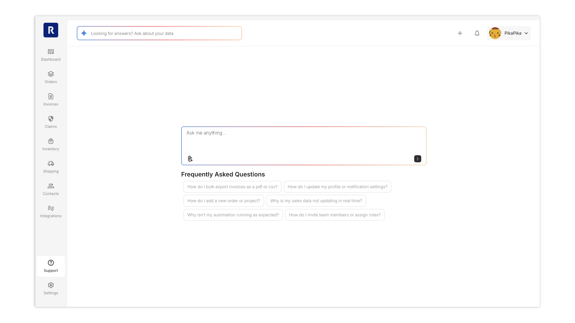
Conversational AI search
Warranty claims automation
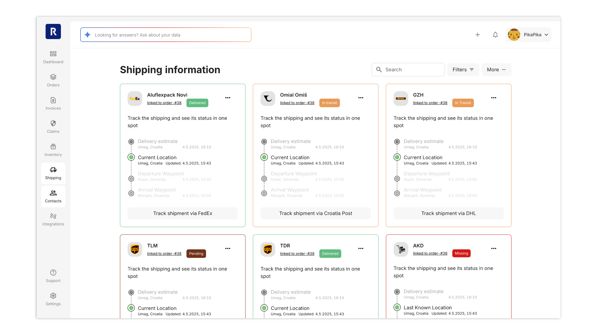
Shipping dashboard redesign
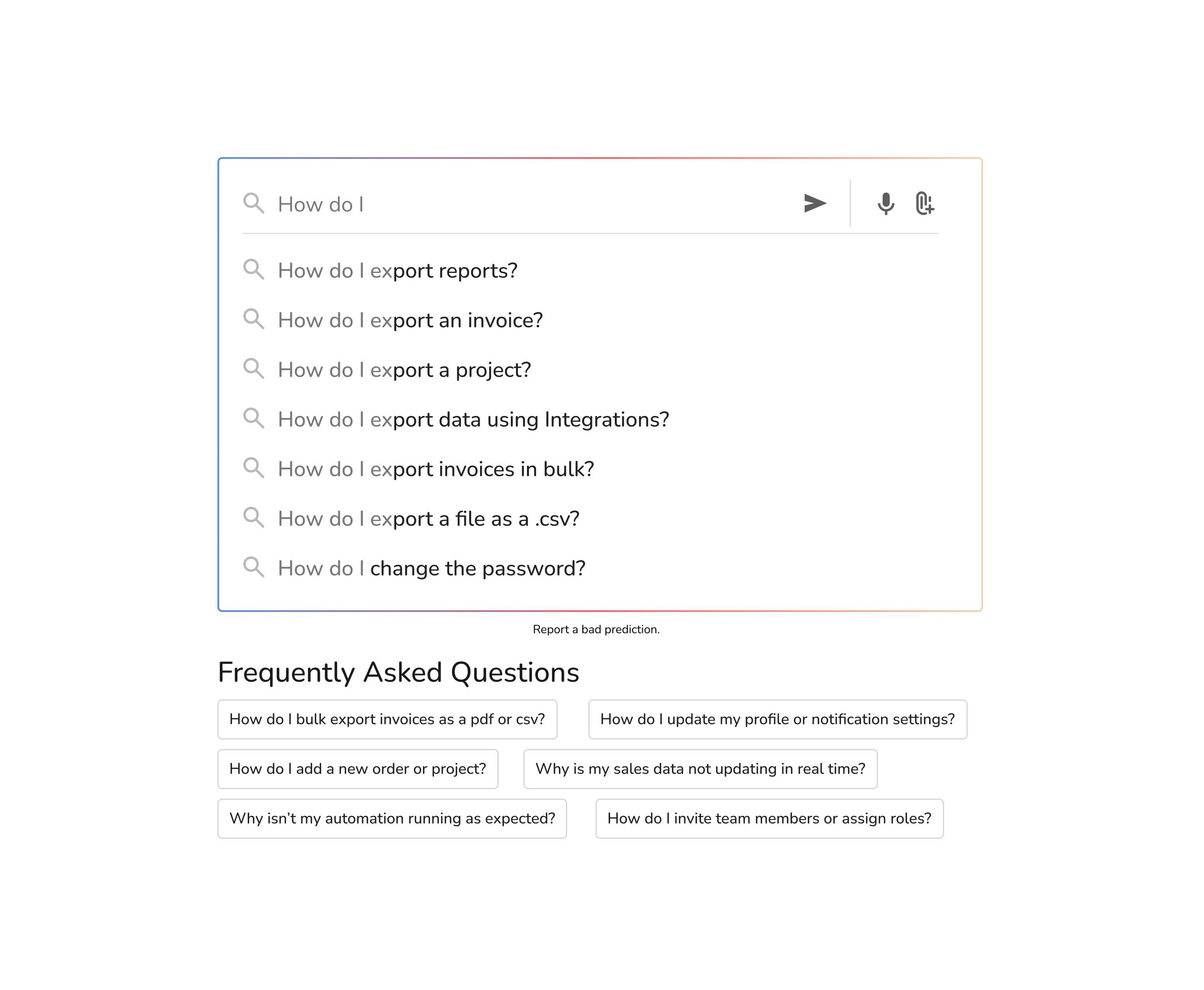
AI-driven support
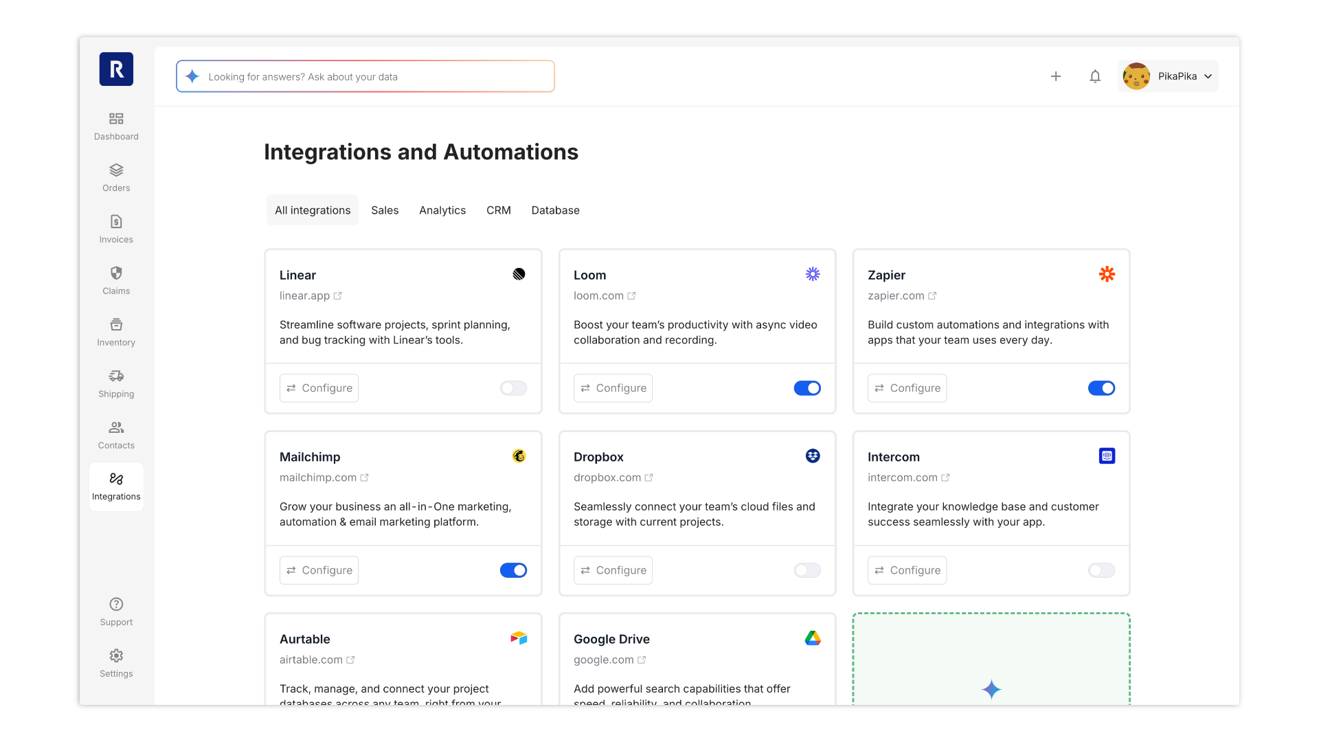
Workflow integrations
Each project brought its own mix of stakeholders, shifting priorities, and technical puzzles. The B2B pace demanded both speed and polish
Used a 70-20-10 focus split to stay sharp:
70% of effort on top priorities (AI search, charts and tables, claims)
20% on secondary projects (shipping dashboard)
10% on everything else (support, integrations)
Kept the framework flexible—always ready to pivot as needs changed.
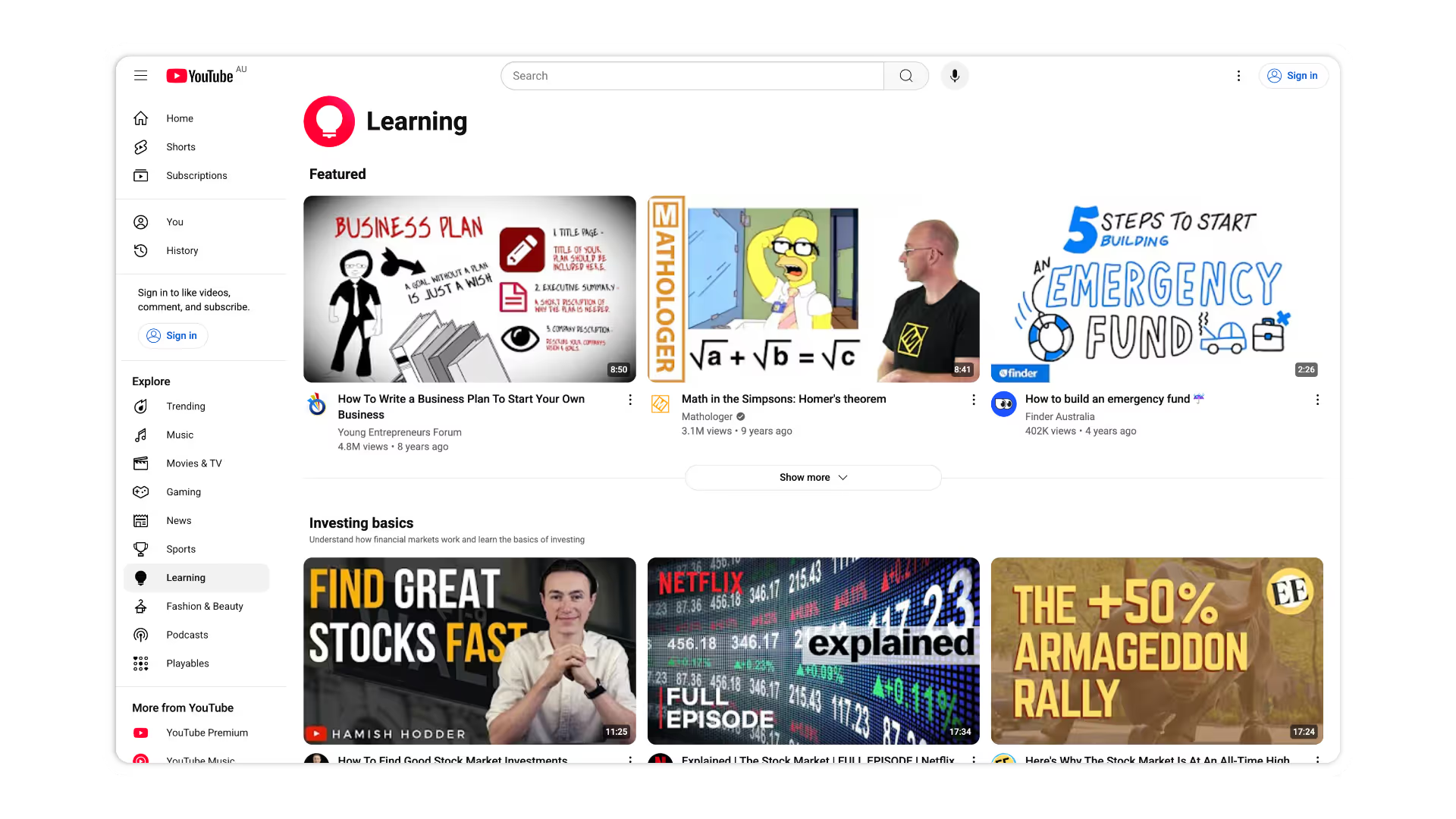
Yes, I borrowed from the best—Jakob’s Law, YouTube’s layout—but I wasn’t interested in just another “familiar” dashboard. I wanted users to feel like they’d upgraded, not just settled in. That meant obsessing over the details: a font you never have to squint at, icons that actually help, and colours that make data pop without screaming for attention.
Limited Resources: Tight deadlines, lots of moving parts, lean team.
Collaboration Hiccups: Needed smoother handoffs between design and dev—especially as AI features moved fast.
Testing on the Fly: Without time for formal research, we relied on rapid prototyping and real-world feedback.
Trusted Patterns: Used proven UI components to cover most needs right away.
Design Tokens: Established a unified look and feel, speeding up both design and development.
Prototype, Test, Repeat: Quick iterations meant smarter releases and fewer surprises.
Quicker Launches: With 70% of the basics handled, we could focus on the 30% that made a real difference.
Iterate Where It Matters: More time for the details users actually notice.
Better Feedback: Early, frequent, and actionable.
Our strategy: make the dashboard feel like a tool users already know (Jakob's Law). Sticking to familiar patterns minimised the learning curve and boosted user confidence from the first click.
But the difference is in the fresh details. Crisp typography, smart spacing, and clear content transform complex data into something users can actually use—and enjoy.
No time for endless research? No problem. I went straight to what works: familiar patterns, proven layouts, and zero guesswork for users. Inspired by YouTube’s clarity, I built a dashboard that feels instantly comfortable—so users can dive in, get things done, and maybe even smile at how easy it all is.
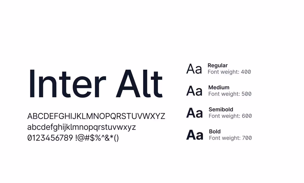
We picked Nunito for its clean readability and rounded character set.
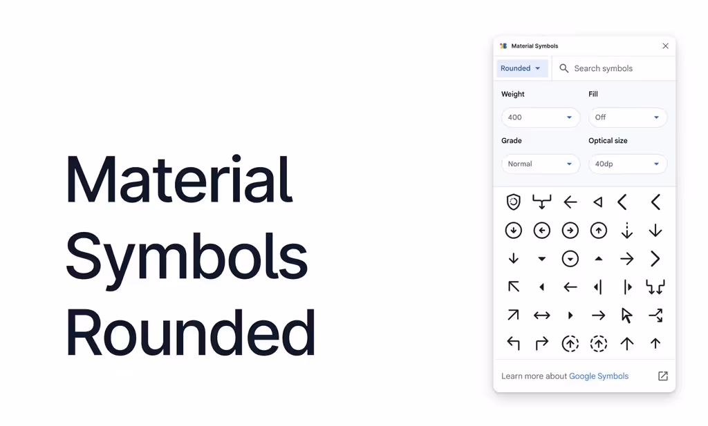
Google Material Icons gave us a huge library, seamless integration, and quick workflows.
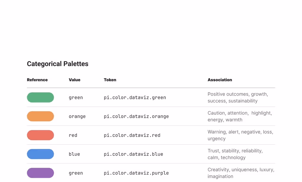
Classic signals—green for go, orange for caution, red for stop—made insights obvious at a glance.
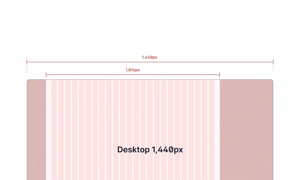
A flexible 1,440px grid with a 1,016px container, and a mobile layout inspired by YouTube, ensured it looked sharp everywhere.
We sweated the small stuff—because in data design, the tiniest adjustments can turn confusion into clarity.

Context at a Glance: Inline highlights and tooltips put key info right where it’s needed.
Actionable Alerts: Smart notifications flag what matters, so nothing slips through the cracks.
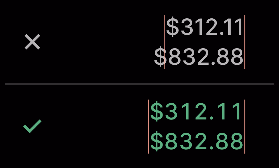
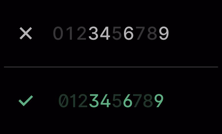
KPIs That Snap Into Place: Fixed-width numbers keep metrics perfectly aligned—trends pop, and comparisons are effortless.

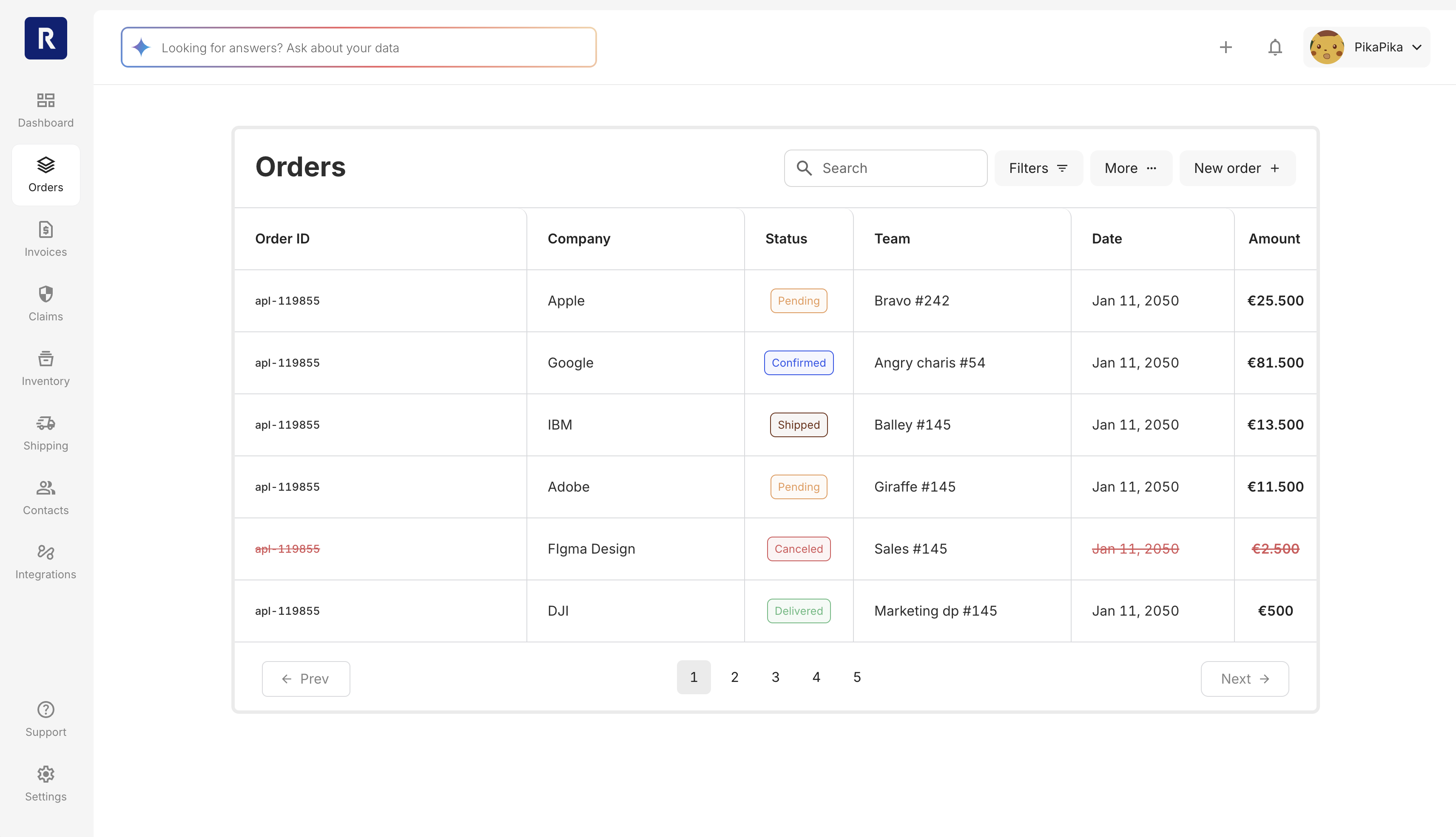
Alignment That Makes Sense: Names left, numbers right. It’s the fastest way to compare, spot outliers, and get on with your day.

Dates Without Drama: Localised formats, everywhere. Whether you’re in Melbourne or Munich, you’ll know if 09/10 is September or October.

Green Days, Made Obvious: Shipping’s cleanest and busiest moments are highlighted—peak days and green milestones jump out, so the team can act, not guess.

Pin What Matters: Users can pin key projects or claims for instant access—no more digging through lists.
Bulk Actions: Edit, export, or assign multiple items in one swoop—batch work, not busywork.
Seamless Handoffs: Integrated actions mean support and sales teams stay in sync—no more lost tickets.

Categorical Colours: Ten distinct hues—every status or team stands out.

Sequential Colours: Colour ramps make trends and totals pop, tuned for light and dark themes.

Diverging Colours: Contrasts spotlight what’s up, down, or needs attention.
With the basics locked in, the UI details turned property data into something genuinely useful.
This project pushed my adaptability and focus, delivering growth in unexpected ways. Here are the highlights.
Key Contributor: Helped shape the dashboard’s UX, weaving advanced AI features into every layer.
AI at the Core: Enabled users to “talk to their data”—ask questions and see instant, visual answers.
Smarter Claims: Built an AI-powered warranty claims system for industrial parts, streamlining the process.
Trusted Patterns: Leaning on proven UI patterns and components covers most needs right out of the gate.
Design Tokens: A unified design language speeds up everything.
Prototype, Test, Repeat: Quick feedback cycles make for smarter, more resilient releases.

